You’re getting the clicks.
People are seeing your ads, landing on your product page, scrolling through the flavors, and then leaving.
So why aren’t they buying?
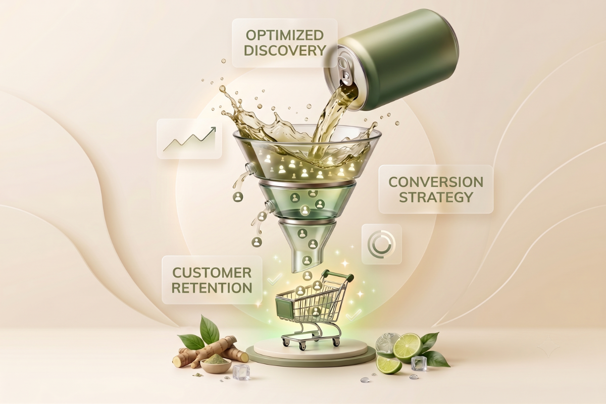
Because traffic does not automatically create sales. Your beverage product page still has to answer the questions standing between interest and purchase:
What makes this drink different?
What will I get from it?
Can I trust the brand?
Is it worth the price?
What should I buy first?
Miss even one of those questions, and the shopper may hesitate long enough to leave.
That hesitation becomes expensive quickly. Baymard Institute’s analysis places the average online cart abandonment rate at approximately 70%, meaning most shoppers who show purchase intent still fail to complete their order.
The good news? You may not require more traffic
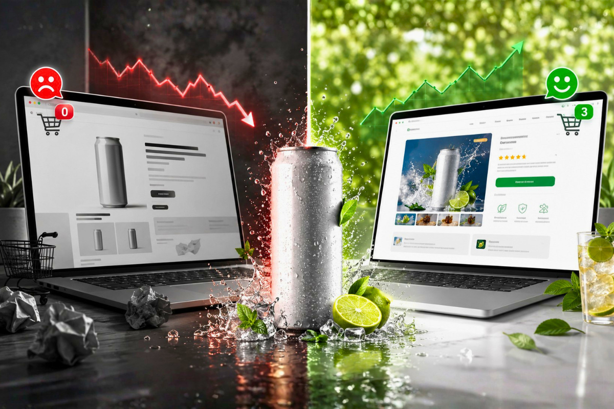
You may simply require a product page that does a better job of converting the traffic you already have.
Here are seven common reasons beverage product pages lose sales and the practical fix for each one.
Why Your Beverage Product Page Is Losing Sales
A beverage product page may attract plenty of visitors and still lose sales when it fails to communicate value, build trust, or make purchasing easy. The following seven issues reveal the most common conversion barriers and how to fix each one.
1. Your Hero Image Doesn’t Sell the Benefit
Many beverage brands treat the hero section like a product photoshoot.
There is a polished can floating against a colorful background. Maybe there are a few splashes, fruits, or ice cubes around it.
It looks good.
But it does not necessarily sell.
Your hero section has one job: help visitors understand why they should care about the product within seconds.
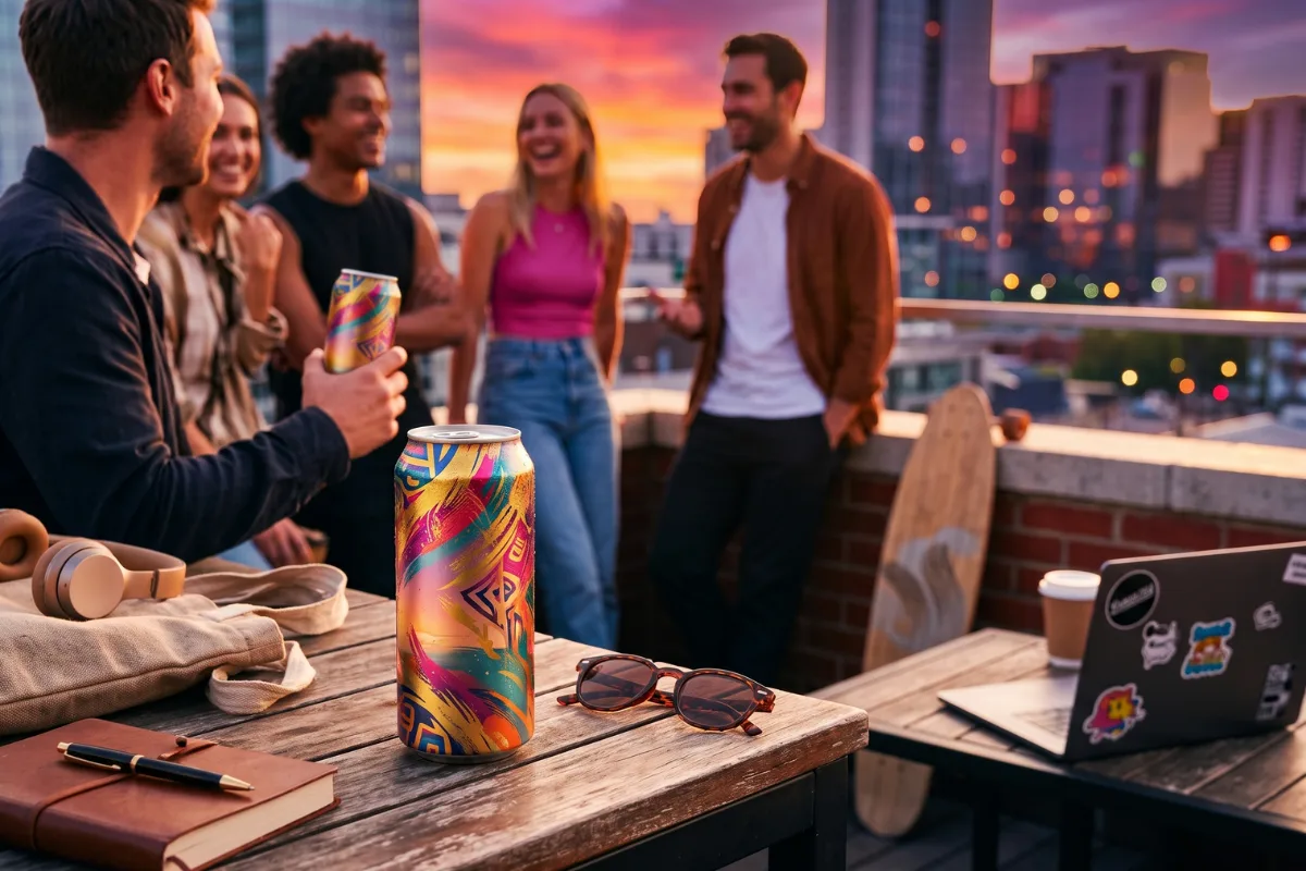
A can-only image shows what the product looks like. A conversion-focused hero image shows where the product fits into the buyer’s life.
For example:
A hydration drink can be shown beside a gym bag after a workout.
A functional sparkling beverage can be positioned as an afternoon alternative to another coffee.
A drink mix can be shown being poured into a bottle before travel.
A zero-sugar soda can be framed as a familiar refreshment without the usual sugar load.
The fix:
Pair the product with one clear use case or benefit.
Your hero should ideally include:
The product in its packaging
A lifestyle or usage cue
One primary benefit
A visible CTA
Essential purchase information, such as pack size or subscription savings
Do not make customers decode abstract branding before they understand the offer.
Show the beverage. Show the occasion. Show the reason to buy.
2. Your Headline Talks About Features, Not Outcomes
Your shoppers do not wake up wanting “12 fluid ounces of naturally flavored sparkling liquid.”
They want a satisfying drink for a specific moment.
Features matter, but they usually support the purchase rather than lead it.
Consider this product headline:
A Lightly Carbonated Functional Beverage With Botanical Ingredients
It may be accurate, but it does not communicate a strong reason to continue reading.
Now compare it with:
A Bright, Alcohol-Free Sparkling Drink Made for Your Evening Wind-Down
The second version creates context. It helps shoppers picture when and why they might choose the product.
The fix:
Build your headline around the product’s primary outcome or occasion, then use the subheading to explain how the product delivers it.
A simple structure is
Desired experience or use case
Supported by product format, differentiator, or key feature.
For example:
Hydration That Actually Tastes Like Something
Electrolyte drink mixes in fruit-forward flavors with no bulky bottles to carry.
Or:
Your Afternoon Pick-Me-Up—Without Another Cup of Coffee
A sparkling functional beverage made for busy workdays and on-the-go routines.
The goal is not to make bigger claims. It is to make the product’s relevance clearer.
3. You Have No Social Proof Above the Fold
A shopper lands on your page and sees your claims.
Naturally, they assume you think your own beverage is excellent.
What they want to know is whether anyone else agrees.
Reviews buried near the bottom of the page cannot resolve that doubt during the visitor’s first impression. By the time customers reach them, assuming they reach them at all, they may have already decided the product looks risky.
This is especially important for newer beverage brands that do not yet have widespread name recognition.
The fix
Bring a concise proof point into the first screen of the page.
That could include:
A star rating and review count
A short customer quote
“Trusted by” retailer or publication logos
The number of drinks sold
User-generated content
A relevant award or independent certification
For example:
4.8 from 325 verified customers
“Finally, a variety pack where I liked more than one flavor.”
Keep it specific. “Customers love us” is weak proof. A rating, quote, or measurable point feels far more credible.
The rest of the page can include longer testimonials, video reviews, and customer photos. Above the fold, you only require enough proof to reduce the first layer of doubt.
4. Your CTA Is Weak, Vague or Buried
Some beverage product pages make visitors work surprisingly hard to buy.
The CTA appears only after a long block of copy. It blends into the page background. Or it uses passive wording such as
Learn More
Explore
Continue
Discover the Collection
These may be acceptable navigation labels, but they do not clearly move a high-intent shopper toward purchasing.
Your CTA should not create a puzzle. It should make the next action obvious.
The fix
Use direct, product-specific CTA language:
Add 12-Pack to Cart
Build Your Variety Pack
Try All 8 Flavors
Start My Subscription
Get the Starter Bundle
Then make the button difficult to miss.
On mobile, consider a sticky add-to-cart bar that remains accessible while the shopper scrolls. Include the selected pack, price, and CTA so customers do not have to return to the top of the page after reading.
Also check what happens immediately before the CTA.
A button converts better when it follows a clear value summary:
12 cans · 4 flavors · Free shipping over $50
Add Variety Pack to Cart
Clarity creates action.
5. Your Product Page Loads Too Slowly
Beverage websites are often visually heavy.
They use large lifestyle images, looping videos, animated ingredients, custom fonts, review widgets, subscription apps, and multiple tracking scripts.
Each feature may look harmless in isolation. Together, they can turn the product page into a slow-loading sales obstacle.
Google has reported that 53% of mobile visits are likely to be abandoned when a page takes longer than three seconds to load. Google’s research has also found that the probability of a mobile bounce rises as loading time increases.
That means shoppers may leave before your beautiful product photography even appears.
The fix
Start with the assets and scripts affecting the first visible section.
Focus on:
Compressing product and lifestyle images
Using modern image formats such as WebP
Avoiding autoplay video in the hero
Lazy-loading content below the fold
Removing unused apps and tracking scripts
Limiting unnecessary font files
Testing speed on mobile rather than desktop alone
Do not judge performance based on how quickly the page loads on your office Wi-Fi.
Test it under realistic mobile conditions.
A simpler page that loads immediately can outperform a visually impressive page that makes buyers wait.
6. You’re Missing the Trust Signals Buyers Expect
Buying a beverage online involves more uncertainty than buying it from a supermarket shelf.
Customers cannot pick up the can, inspect the packaging, or ask someone nearby about the product. They have to rely entirely on the information your page provides.
That is why trust signals are not decorative extras. They help shoppers feel comfortable completing the transaction.
Depending on the beverage category, customers may look for the following:
Ingredient transparency
Nutrition facts
Allergen information
Third-party lab results
Manufacturing standards
Quality certifications
Shipping details
A satisfaction guarantee
A clear refund policy
Secure payment methods
Hiding this information in the footer creates unnecessary friction.
The fix-
Place relevant trust signals close to the buying decision.
For a functional beverage, that may look like the following:
Full ingredient transparency
Third-party lab tested
30-day satisfaction guarantee
Secure checkout
Link each claim to supporting information where appropriate.
Do not overload the page with dozens of badges. Use the signals that resolve genuine buyer concerns.
The test is simple: What would a cautious first-time customer want to verify before putting this beverage into their body?
Answer those questions before checkout.
7. You Don’t Offer a Subscription or Bundle
Selling beverages one unit at a time creates two problems.
First, shipping can make a small order feel poor value.
Second, the customer has to make another full buying decision when the drinks run out.
Bundles and subscriptions reduce both barriers.
A variety pack helps first-time customers explore flavors without committing to a full case of one option. A subscription gives repeat buyers a more convenient way to reorder while improving predictable revenue for the brand.
The fix
Give shoppers a small number of clearly differentiated purchase options.
For example:
Try It
12-can variety pack
Stock Up
24-can bundle with 10% savings
Subscribe & Save
Recurring delivery with 15% savings
Show the exact saving, not just “best value.”
You can also build bundles around customer occasions:
Morning Routine Bundle
Workout Hydration Pack
Weekend Hosting Case
Best-Seller Variety Box
Build-Your-Own Flavor Pack
Avoid presenting too many combinations at once. Choice is helpful until it becomes another reason to delay the purchase.
Case Study: How Mitra9 Turned Traffic Growth Into Stronger Sales Growth
Getting more visitors is useful but only when the website converts that attention into orders.
Mitra9’s performance shows what can happen when traffic growth is supported by a stronger e-commerce experience and a clearer path to purchase.
Over the measured year-over-year period, the brand generated:
$7.1 million in gross revenue, up 99%
57,772 total orders, up 120%
678,000 annual sessions, up 60%
A 3.19% conversion rate, up 4%
6,907 returning customers, up 94%
An $85.63 average order value, up 18%
A 91% increase in add-to-cart rate
The most important comparison is traffic versus order growth.
While website sessions increased by 60%, total orders grew by 120%. In other words, sales growth outpaced traffic growth by a significant margin.
That suggests the brand was not relying on acquisition alone. More visitors were progressing from product discovery to cart and completed purchase, while higher average order value and returning-customer growth helped increase the value of that traffic.
For beverage brands, this is the real purpose of product page optimization. A high-performing PDP should do more than display the product. It should communicate the benefit quickly, remove uncertainty, make purchase options easy to understand, and give customers a clear reason to add more or come back again.
Your Traffic May Not Be the Problem
A beverage product page can look polished and still lose sales.
An unclear hero section, feature-heavy headline, buried CTA, slow load speed, weak trust signals, or limited purchase options can create enough friction to stop an interested shopper from buying.
The Mitra9 results highlight the opportunity: traffic increased by 60%, but orders grew by 120%. When the shopping experience works harder, revenue can grow faster than visitor numbers alone.
So, which of these seven issues is costing your beverage brand the most?
We rebuild beverage product pages that turn more clicks into carts and more carts into customers. Get a free PDP teardown to uncover the conversion gaps on your page.